The power of frictionless design
Feb 18, 2019

Katy Cesarotti | Gallery Design Studio Editor + Copywriter
Confusing or cluttered websites are more than just bad design—they’re bad for business. When your site is difficult to use, you end up with higher bounce rates, fewer conversions, and ultimately, more potential customers that opt out of the process altogether.
With frictionless design, you can leverage your website to get more leads and conversions, and ultimately, make more sales.
Friction refers to any “seams” in the user experience that could annoy or frustrate potential customers. It might include interactions and tasks like searching your website, signing up for a newsletter, or reading information on your homepage. Friction frustrates potential customers and prevents them from continuing down the sales funnel.
Frictionless design gives you intuitive websites that are simple to use and enjoyable to explore. Users immediately understand the logic and flow of your digital presence. Even companies with strong digital presences always have room to streamline for a better, simpler user experience.
Here are five ways you can immediately eliminate friction from your online presence.
1. The fewer steps, the better
Think about the user journey as a whole. What does a totally new customer have to do to find, choose, purchase, and use your service? Are there any unnecessary steps?
If it takes more than ten steps to complete a basic task, like contacting customer service, look for ways to simplify it.
Sometimes you have to get complicated: maybe you need to ensure payment information is secure, or you’re walking the user through a complicated process. If it’s necessary to have a lot of steps, try to make them as easy as possible to get through. Compare each task to a competitor’s site: can they do it in less? Can you?

Amazon’s one click or buy button allows users to make purchases without re-entering their billing and shipping information every time.
2. When breakups are good
In specialized industries, like finance or tech, you might have more complicated information to convey to your customer. Look for ways to break down tasks or information into more manageable chunks.
If you have instructional videos, break them into modules for each phase of the product. Long blogposts? Spread ‘em out over several articles. With small units, you give the user a little win when they complete each stage, and make it easier for them to process information.
3. It’s okay to be boring (sometimes)
Grocery stores all follow the same layout: produce right when you walk in, then the bakery, then the meat section, and so on. Even when you go to a new store, you know what to expect when those doors slide open.
Websites work the same way. There are a couple of features users automatically expect, and when they don’t find them in the usual place, your site can create friction.
Between pages, your site should generally follow the same format, so it’s easy and enticing for potential customers to click around.
Of course, you should get creative to make your brand stand out! Just be careful that your original flourishes don’t get in the way of usability.

Fun and functional: the Southwest website has a creative Valentine’s Day graphic on the homepage, but keeps the usual search bar and login links in the top right corner. Look at all that breathing room!
4. Keep it simple
Too much visual “noise” and clutter distracts the customer from completing their goal. Take out any unnecessary steps, questions, or decisions to focus attention on the core task you want them to complete.
In the spirit of Marie Kondo, consider each webpage or piece of content and ask yourself, “Does it spark joy?” Or, in our case, does it help the user?
If not, cut it.
Especially on landing pages, use simple language to clearly explain what you do and why they should care. White space also gives the viewer breathing room, to give their eyes (and brain) a rest.
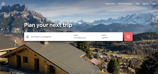
The AirBnB gets back to basics with a striking photo, simple navigation, and intuitive search bar. No extra content here.
5. Balancing Act
Thinking takes a lot of energy. Alternating between different forms of content is easier for your viewers to process than long, dry chunks of text. Shake up how you present information with text, graphics, video, and animations. A balanced rhythm gives your user's eyes a rest and don’t require as much head-scratching to process.
Can you translate some text into graphics, or still images into video? Look for creative ways to tell your story in new formats.
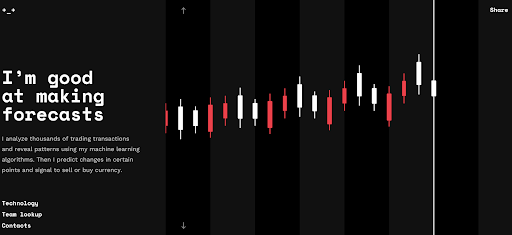
The crypton.trading website visualizes how its cryptocurrency-trading bot works with eye-catching animation and a scrolling landing page to draw users in.
Good Friction
Now that we said all that...friction isn’t always a bad thing.
How many times have you accidentally closed out of a Word document, only for a pop-up to save the day?
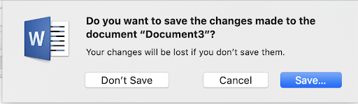
This message appears when you close a document with unsaved edits in Microsoft Word.
There are a couple of situations where you might want to create some intentional friction for your users:
- Prevent user mistakes. Add an opportunity to double-check information before users make purchases or important decisions. For the customer, it’s a little bit of work that prevents a lot of work down the road.
- Multi-step authentication. Especially when you deal with confidential user information, adding authentication steps (like texting a confirmation code to their phone) makes users feel more secure.
- Make a long process seem shorter. Animated progress indicators or attractive loading screens tell users yes, your page is actually loading, and keep their eye busy as they wait.
- The hard sell. A popup on your website—for example, a newsletter signup bar that covers the content they’re trying to read—can lead to more conversions if used sparingly.
With too much friction in your user experience, potential customers might opt out before you have the chance to show them just how great your company is.
Frictionless design gives customers the content they need (and leaves out what they don’t). Simple, intuitive visuals allow you to tell your story, connect with customers, and turn leads into sales.
About Gallery Design Studio
We specialize in B2B creative solutions that address client needs and wants at every stage of the customer journey. From a customer’s first interaction with a brand to their first purchase and beyond, we craft experiences that are engaging and easy to navigate. Our services:
- Customer Experience Design (CX)
- Web & App design (UX/UI)
- Video & Animation
- Graphic Design & Marketing Collateral
- Copywriting
Have a project in mind? Contact us!
About the Writer
Katy Cesarotti is a copywriter at Gallery Design Studio. Katy believes that, with clear and concise copy, innovators can spark emotion and drive action in their readers. She’s written for magazines, blogs and cutting-edge startups.

